With 2017 having just arrived I set one of my “New Year Resolutions” in relation to my blog. My goal: Improve my blog. Hence I decided, I should get my logo figured out. So I spent my today working on this logo and also, I have an exam on Saturday and I’m procrastinating studying…but we’ll say this logo was driven by resolution, not procrastination.
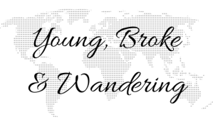
So drum roll please……….I present to you, Young, Broke and Wandering’s official logo! I decided I wanted to really represent the traveling aspect of my blog and opted for spelling out the name of my blog with major landmarks and monuments. I had to finagle them a bit, and some ended up a bit sideways, or upside down, or even connected to others to make a letter.
There is a total of 15 monuments – can you name them all and guess which country they’re from? Comment below if you want to play!


Aha! Worked it out. I was wondering why you had an abstract map of New South Wales for “B”. Now I see what you’ve done.
Hmmm. It kind of works, but it doesn’t jump out and say clever or brilliant. It says, “forced”. I get the idea, but it’s a bit too finicky for me.
LikeLike
Glad you were able to work it out – thanks for the input! 🙂
LikeLike
Very interesting and extremely creative. I never would have thought of something like this. What a fun game trying to identify all the different monuments!
LikeLike
Thank you so much! Glad you enjoyed 🙂
LikeLiked by 1 person
HAHA very creative and interesting logo you have here! I would love to play the game and guess all of the logos, but I would be tagging my friend Google as I am not good with this kind of game. 🙂 Good luck on your exam!
LikeLike
Thank you! Don’t worry it took me a bit to figure out which ones were which while I was creating it :p
LikeLike
Such a thoughtful logo. This reminded me how much time we brainstormed to come up with our domain name 🙂 Great job there
LikeLiked by 1 person
Thank you so much!
LikeLike
This is one of the most creative logos I have ever come across! Totally worth prolonging that studying haha. I have one question, did the bridge (Brooklyn or golden gate?) look better upside down that upright? I would think the curves of the bridge would invoke the “w” more. Still love it though!
LikeLiked by 1 person
Golden gate! & I originally put it upright but it looked more like an M than a W!
LikeLiked by 1 person
Ahh yeah I can see/understand that now. You did such a great job. We are currently trying to do a logo ourself. I have my cousins girlfriend on it since we are not artistic and creative like you!
LikeLiked by 1 person
Thank you so much! It took me a bit to think of one I liked 🙂
LikeLiked by 1 person
hahaha i feel the same like your logo, young, broke and wandering. But i will try to at least eliminate the broke part of it . Like your logo, very creative 🙂
LikeLiked by 1 person
Thank you!!
LikeLike
I see the Eiffel Tower, Burj Al Arab, Stature of Liberty, Christ the Redeemer, Arc de Triumph, Big Ben. Which am I missing!?
LikeLike
The order is:
eiffel tower
london eye
arc de triomphe
chinese arch
statue of liberty
pyramids
big ben
london eye
the washington monument/pisa/space needle
taj mahal
golden gate bridge
colosseum
chinese arch
burj alarab
taj mahal
big ben
christ the redeemer
chinese arch
Statue of Liberty
LikeLike
Oh wow– I thought for sure I would know more of these. I knew some of the “bigger” or more “famous” of them but I definitely did not know all of them!
LikeLike
It does get a bit tricky, thanks for taking the time to play!
LikeLike
Wow such a clever logo! Congratulations, it is awesome!
LikeLike
Thank you so much!
LikeLike
Hahah very clever! I haven’t seen anyone use monuments like this, great job. I’ll admit though that I think the Young & Broke part looks super clear but the wandering part not so much. Could just be me!
LikeLike
Thank you! It was a bit difficult to get it to come out clearly so it’s definitely not just you haha!
LikeLike